Those of you who have been following this blog for a while know that I (Mike) am an artist at heart, and that over the last several years I’ve been growing in both my artistic sensitivity and technical ability. (And I cite Bring It On Down To The Downtown as evidence!) Anyway, a few months ago I had a conversation with an artist friend of mine who shared that the key to his growth as an artist was to be doing art all the time. The reason he was so good was that he was always finding ways to turn whatever he was doing into an art project–to challenge himself to be creative in every arena he could think of. Well, that concept really stuck with me, and ever since I arrived here in Orlando, I’ve been looking for more ways that I could exercise my creative muscles. That was the impetus behind my recent Harvey Cedars Project as well as my recent “Confident Counselor” image.
Well, on the first day of class of the fall semester, for no apparent reason, I got inspired to make little a ‘title’ image that I could put at the top of the class notes that I keep on my computer. Well, once I had completed it, I got inspired to do the same with all my other classes, and now what I have is a collection of images that I think are really fun and would like to share with all of you. So I figured what I would do is show the title image and then (briefly) talk about the class itself so you can get a sense of what I’m taking this semester. Dr. Coupland (the program director) says that this semester is the most academically challenging of the entire program (I don’t know if that’s a good thing or a bad thing….) Anyway, without further ado, here’s a snapshot of the classes I’m currently taking:
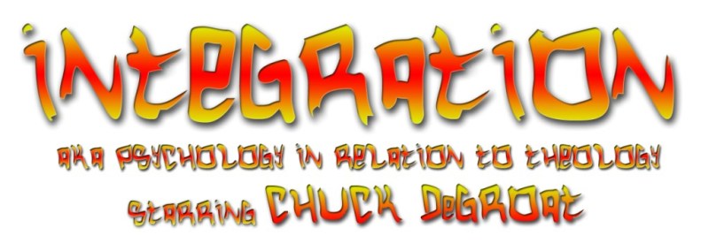
My first class was Psychology in Relation to Theology I, also known affectionately as ‘Integration’. As you might guess, RTS is not the kind of school where scientific psychology is totally disregarded, but at the same time it’s also placed under the overall authority of the Bible. Despite our terminology and our Western conceptions, the two are not at odds. This is probably my simplest image–nothing really special here, just some text on a white background– but it’s the one that started it all so I figured I would include it. Don’t worry, it gets better, folks.
My next class is Introduction to Marriage and Family Therapy. Now I know what you’re thinking–“Gee, ‘marriage and family therapy’ sure looks like a lot of fun! Just look at how cute those kids are! Awwww…” And you’re right–they ARE cute! Image-wise, I kind of wish I had done more with the title text, but the kids just carry this picture into a whole new realm of cute. I’ll let you know exactly how “fun” marriage and family therapy is once I’m further along in the class…
Of all the images that I did for my courses, this one is actually my favorite. I just love how the torn, distressed-looking text expresses in a visual way what Psychopathology is—being mentally damaged (or torn) on some level or another. The background too is an almost violent mix of explosive white highlights and grungy-looking black and grey shadows, which adds a shocking kind of intensity to the image. As I read about all the different mental disorders (I have to read the entire DSM IV-TR!!!), I’m sure that this image will keep coming back to mind, as well as the reminder that a counselor’s job is not to “fix” people that are broken, but to offer help to people who are hurting.
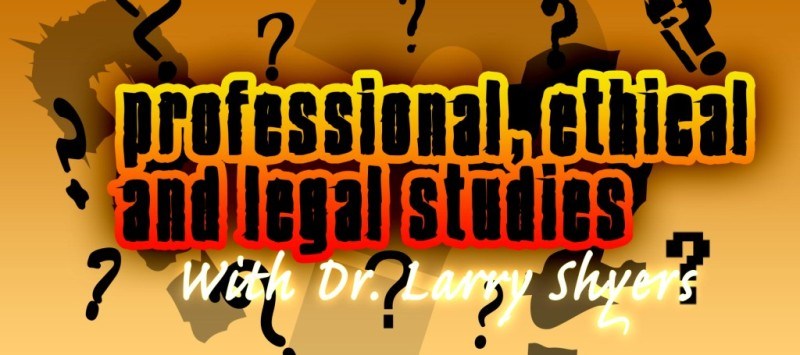
For Professional, Ethical, and Legal Studies, which draws out all kinds of sticky ethical questions, I chose to use a question mark motif. It was more appropriate that I could have guessed– we are really going to be left with more questions than answers in this course. The color in the background reminded me of manilla envelopes, which is appropriate given that we have to learn all kinds of laws and principles and legal requirements, stuff that a lawyer would be better suited to study. I wonder what the laws will be like in Japan…
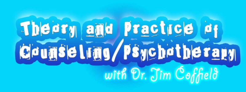
Next is Theory and Practice of Counseling/Psychotherapy. This class has to do with formulating a big-picture understanding of how counseling works, how people change, the reasons people get into trouble, and how they get better–easy stuff, right? 🙂 Image-wise. even though technically there’s nothing super-fancy about this one, I still like the colors, and I love the ‘crooked typewriter’ style font. It just looks, well, psycho!
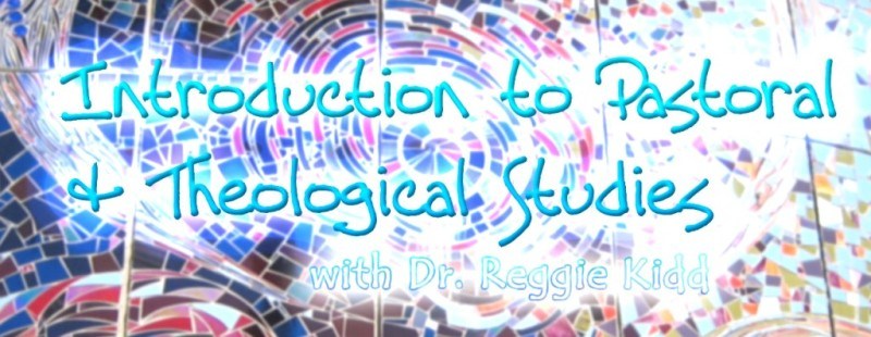
My last class (and my last image) is Introduction to Pastoral & Theological Studies. The reading for this course seems pretty intense, but very interesting–I’ve never really delved this deep into the hard work of systematic theology before. But looking at this picture, you get a deeper sense that the main purpose of this course is to help us worship God better by learning more of what makes Him so glorious. The stained-glass looking image in the background is one that I actually took myself (outside an art museum in Baltimore). One thing that I’m really proud of is that I didn’t use any Google image searches for this project–everything here is original Costanzo-made goodness (TM).
Anyway, that’s what my life will be like for the next 3 months–reading books, writing papers, and working hard at finding excuses to exercise my creativity! I guess I should finally go start studying… 🙂
-Mike


0 Comments